
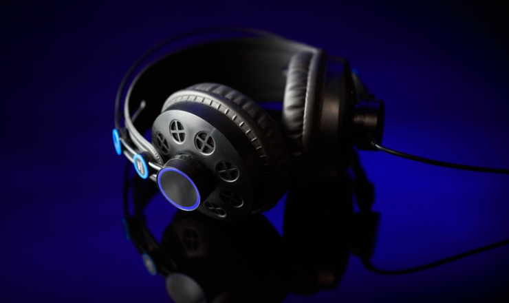
A blue light falls across a cassette player on an empty bedroom floor. Beside it sits a pair of worn headphones, their cable disappearing beneath a curtain. That is the image I have in mind for a fictional debut single called “After the Last Bus”: a quiet pop song about the moment a long night finally ends. The cover needs to suggest that feeling before anyone reads the title.
My starting point is the tension between a small private room and the outside city. I want the music’s imagined loneliness to emerge from ordinary objects, not from a crying face or a dramatic skyline. This is a proposed artwork exercise, rather than a report about an actual release. There is no real artist’s likeness to reproduce and no existing album sleeve to imitate.
A useful cover must survive being reduced to a small square on a phone. The cassette player therefore needs a clear silhouette, with one bright area that gives the eye somewhere to settle. Details such as wallpaper patterns and individual cassette labels can wait. If the scene only works at full size, it will probably struggle in the places where listeners first encounter it.
Turning that room into an original still image is the role of nano banana 3 in this concept. Its text-to-image and image-editing capabilities connect the written scene to a visual draft, then offer a way to explore changes to lighting or composition. The artwork remains a separate creative task: an image model does not compose the song or establish the identity of the imaginary musician.
The room should feel inhabited, even without a person
I would give the cassette player a slight angle rather than place it parallel to the frame. A loosely coiled headphone cable can suggest that somebody recently left the room. The curtain should hang partly open, revealing a narrow strip of window light. These are small choices, but they explain the scene more convincingly than adding several obvious symbols of sadness.
The palette would be mostly deep blue, charcoal, and a little faded cream. One warm reflection on the cassette player’s buttons could stop the image from feeling completely cold. I would avoid a red neon sign because it would compete with the quieter story. The imagined song ends with a sense of possibility, so the room should feel paused rather than abandoned forever.
Describe the light for nano banana 3 before asking for atmosphere
The first brief for nano banana 3 could read: “Square editorial photograph-style illustration of a fictional bedroom at dawn. A small cream cassette player and worn headphones rest on a dark wooden floor beside a partly open curtain. Cool blue window light crosses the objects diagonally, with a subtle warm reflection on the buttons. Low viewpoint, uncluttered composition, no person, no logos, no readable lettering.”
That description gives the scene a source of light, a subject, and a viewpoint. Merely asking for a nostalgic or cinematic image would leave too many decisions unresolved. I would also leave the song title out of this first generation. Typography needs its own consideration, and a blank area that looks convenient in a prompt may not remain convenient in the actual result.
If I had an original photograph of a cassette player available, and permission to use it, it could provide a reference for the object’s shape. I would still check the resulting details. A reference is useful material for the creative brief, not a reason to assume every button, cable, and reflection will be reproduced faithfully.
When a handsome image tells the wrong story
Suppose the first draft looks like a glossy product advertisement: the cassette player is perfectly centred, the floor is spotless, and the headphones form an elegant circle. It might be attractive, yet it would miss the point. My next edit in nano banana 3 would ask for a less symmetrical arrangement, a softer highlight, and a slightly more ordinary room while keeping the cassette player clearly visible.
I would inspect the entire frame after that edit. A change to lighting might also alter the curtain or obscure the headphone cable. The best revision is not necessarily the one that looks most polished. For this particular song concept, a modest amount of visual irregularity helps the objects feel connected to an absent listener rather than arranged for a catalogue.
Another possible issue is excessive darkness. On a large monitor, the floorboards might be distinguishable; on a small screen, they could merge into a black patch. Rather than brightening everything equally, I would ask for a little more separation around the cassette player’s lower edge. The scene can retain its quiet mood while making the central object easier to recognise.
Give the nano banana 3 artwork room for a title
Once the image holds together, I would test the fictional song title in a separate design editor. Small cream lettering near the upper left could echo the cassette player’s colour. My preference would be a restrained typeface without decorative effects. A heavy outline or elaborate shadow could make the cover feel busier than the imagined song.
The image produced with nano banana 3 would become the visual foundation, while the artist name and song title would remain editable text. That separation would make it easier to check spelling, change hierarchy, and prepare versions for different layouts. I would compare a title-bearing version with an image-only version rather than assume the words must always be equally prominent.
Keep the same idea across different crops
A square cover and a wide announcement graphic do not give the objects the same amount of space. For the wide version, I would preserve the relationship between the blue light, cassette player, and curtain, while leaving an additional quiet area for the release information. Simply stretching the square would distort the objects and undermine the care spent on the composition.
A further image edit in nano banana 3 could explore that wider arrangement, followed by another check for changed objects and awkward shadows. The announcement date and listening details belong in the design editor, based on the actual release plan if the fictional exercise ever becomes a real project. The image should carry the mood; it should not invent practical information.
My final selection would be the version that still feels like a room after somebody has gone home: recognisable objects, a little distance, and light beginning to change. I would judge it at thumbnail size as well as full size, then retain the clearest cover and its companion crop. The goal is a small, specific visual world that gives a pop song an inviting first impression.

The Pop Blog general news and updates, mostly from press releases and conferences.